You can make pottery feel personal with easy dots, stripes, tiny hearts, or a name in a neat monogram—cheap, beginner-friendly, and oh-so-charming! Grab ceramic paint or underglaze, small brushes, and painter’s tape, then sketch lightly, paint 2–3 thin coats, and let each layer dry. Try a half-dipped color block or speckles for a modern look, and save the sweetest surprise, like a tiny border star, for last. Keep going, and a few clever ideas will pop up next!
Key Takeaways
- Start with simple shapes like polka dots, stripes, or color blocking, then let the pottery form guide the design.
- Add personal touches with monograms, names, tiny hearts, stars, or a short quote for a meaningful finish.
- Use small brushes, painter’s tape, and fully dry layers to keep edges crisp and designs polished.
- Try themed motifs like florals, seasonal icons, or calm mandalas for an artistic, hand-painted look.
- Finish with textures like speckles, splatters, or subtle border details to make the piece feel unique.
Choose Your Pottery Painting Style
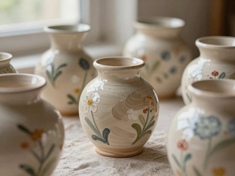
When you’re picking a pottery painting style, start simple and let the shape of the piece do some of the work for you—seriously, it’s easier than it sounds!
Try polka dots first: grab a sponge, cotton swab, or brush end, tap on colorful spots, and you’ll get a cheerful look with almost no stress.
Want more control? Go for stripes or lines, which build brush stroke practice and keep things crisp.
If you’re feeling playful, doodle hearts or stars.
Color blocking feels bold and polished, and monograms make every mug or bowl feel like it belongs to you.
Use glaze finish tips and have fun!
Gather the Right Brushes and Glazes
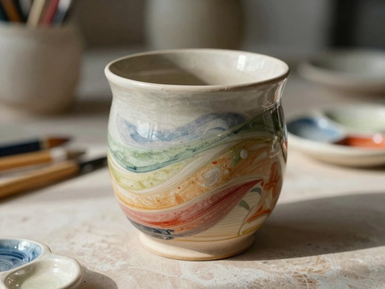
Now that you’ve picked a fun painting style, it’s time to grab the tools that’ll help your design look neat instead of, well, “oops, that was supposed to be a stripe.”
Small detail brushes work great for faces, dots, and monograms, while medium brushes make stripes, fills, and bigger shapes much easier to handle.
- Rinse brushes well between colors for clean edges.
- Try underglazes in studio, then dry each coat fully.
- Use ceramic acrylics at home, plus a clear sealer.
- Check food-safe materials after firing, especially for mugs.
Brush cleaning tips and Color testing samples keep you in the club, and a clear glaze can make everything pop!
Easy Pottery Painting Ideas for Beginners
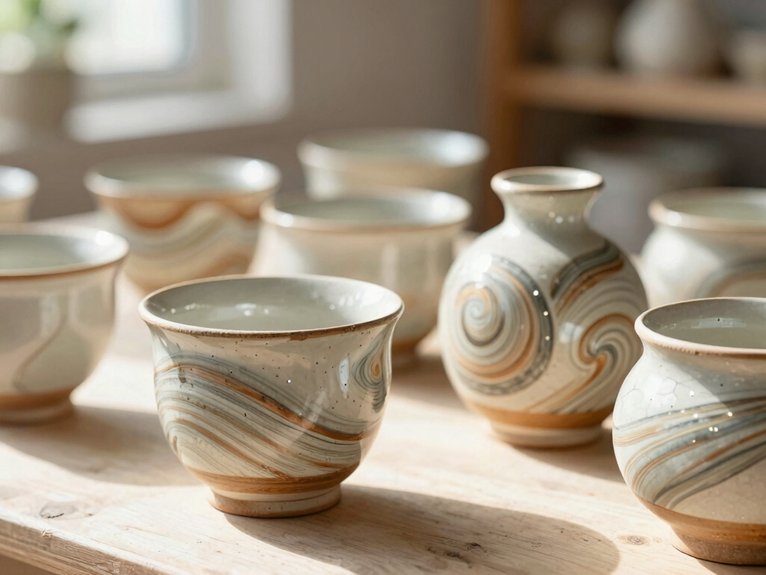
You can start with super simple patterns like polka dots, stripes, tiny stars, or a tiny hand-drawn edge, and they’re perfect when your brushwork isn’t exactly “museum level” yet—no worries, that’s part of the charm!
If you’re painting at home, grab ceramic acrylic paint, painter’s tape, and maybe a sponge or cotton swab for easy shapes, then seal it if you want a hand-wash-only piece that lasts.
For a fun personal touch, add a name, a tiny heart, or a little icon in a spot that surprises people, and if you’re working with studio bisque pottery, underglaze plus a few dry coats can make even a wobbly design look polished after firing.
Simple Starter Patterns
A few simple starter patterns can turn a plain piece of pottery into something that looks cheerful, polished, and totally made by you!
Try pattern color testing first, then map your design with tape resist edges for easy control.
- Polka dots: use a sponge or cotton swab, then add 2–3 coats for bright color.
- Stripes: paint light colors first, let each layer dry, and keep lines relaxed.
- Doodles: tiny hearts or stars feel playful, not perfect.
- Color blocks: keep one clean border and let it shine.
For a small wow, tuck in a hidden sun or initial!
Easy Personal Touches
| Idea | Materials | Result |
|---|---|---|
| Dots | Paint, brush | Cute, quick |
| Stripes | Tape, paint | Clean edges |
| Monogram | Pencil, paint | Personal touch |
| Thumbprint heart | Paint, finger | Handmade charm |
| Fruit icon | Paint, brush | Tiny surprise |
Let glaze drying fully, then add berries, quotes, or one bold mark—suddenly your mug feels like it belongs with you!
Paint Polka Dots for a Playful Look
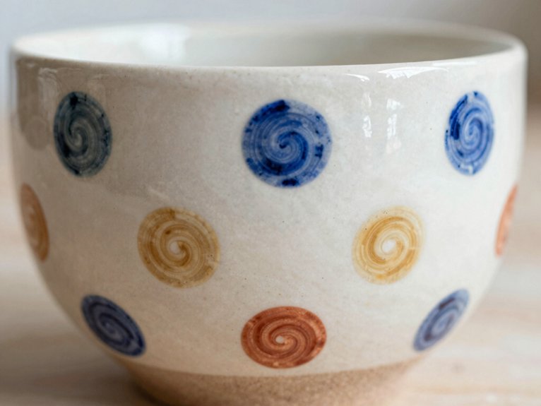
When you want a design that feels cheerful without being fussy, polka dots are the perfect place to start!
You can skip perfect monogram placement for now and play with paint color theory instead, choosing colors that feel like your crew.
- Grab a sponge, cotton swab, or brush end
- Stamp dots across your bisque mug
- Make small or big dots by changing paint load
- Let each layer dry before adding more
Bright dots on a pale base pop, and clear glaze makes them shine.
Easy, low-cost, and honestly, a little irresistible!
Try Stripes and Lines for Clean Style
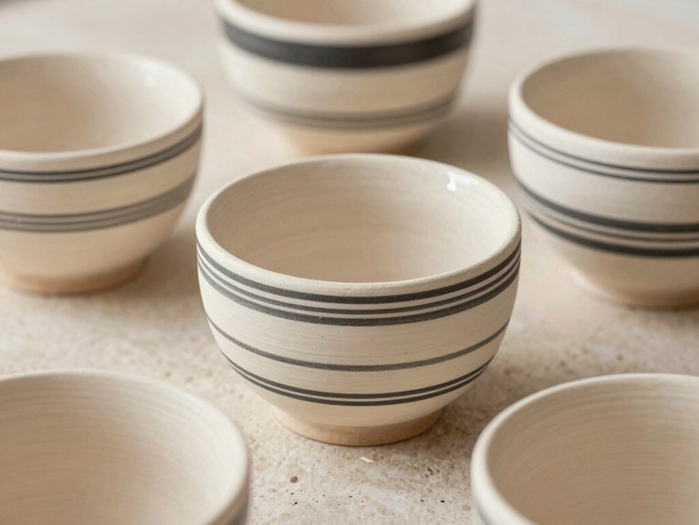
Bold horizontal bands can give your pottery a crisp, modern feel, and they’re easier than they look—just mark your spacing, tape the edges, and paint from light to dark so everything stays neat.
If you want a little more motion, try diagonal line variations with the same simple tools, and keep your brush strokes smooth in one direction for a clean finish.
Let each stripe dry fully before the next one goes on, because that’s how you get those sharp, wow-worthy lines without the paint turning into a tiny muddy mess!
Bold Horizontal Bands
If you want your pottery to feel clean, modern, and just a little bit elegant, start with horizontal bands that wrap around the mug or plate like a neat little outfit. You’ll fit right in with this easy style, and the result feels polished without trying too hard!
- Mark the widest part first with pencil.
- Press painter’s tape firmly for crisp edges.
- Paint the lightest band first, then dry.
- Add 1–2 darker bands with a color matched glaze for simple clean up.
Use a medium flat brush for broad stripes, and a smaller round brush for edges. A simple palette keeps it bold, not busy.
Diagonal Line Variations
To give your pottery a crisp, fresh look, try diagonal lines that sweep across the surface like they’re headed somewhere important! Use a thin brush or painter’s tape, starting at one rim edge and pulling steady strokes across the form.
For tight parallel lines, wide alternating bands, or a V-shaped chevron, keep your symmetry planning simple and your color harmony strong. Tape helps you get clean edges, and peeling it off while the paint’s a bit wet keeps bleed away.
Paint light to dark, let each section dry, and focus on texture layering, not chaos. After glaze curing, you’ll have a bold, friendly piece that feels made for your crew!
Add Doodle Art and Tiny Symbols
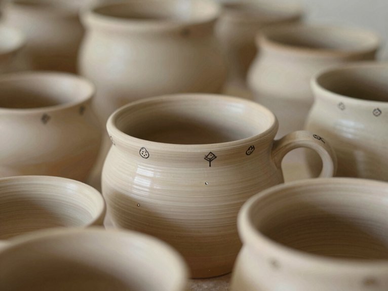
A few tiny doodles can change a plain pot or mug into something that feels playful and personal, and yes, they’re way easier than they look!
You don’t need elaborate skills, just Texture Techniques, Brush Control, and a little patience.
- Sketch tiny hearts, stars, or line shapes first.
- Use a fine brush for clean little marks.
- Try stencils or painter’s tape for repeats.
- Add a monogram, leaf, or fruit dot for a signature vibe.
Practice on paper, then paint your symbols close together, using a cotton swab for dots.
The result? A handmade piece that feels like yours, right away!
Use Color Blocking for Bold Contrast
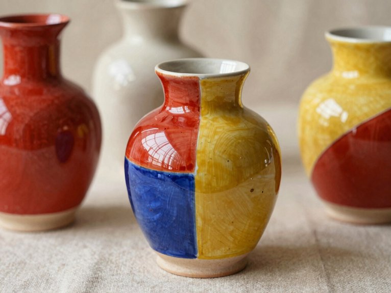
When you want your pottery to look bold fast, color blocking is the move—it’s simple, modern, and seriously eye-catching! You can paint big, solid sections in black and white, or pair complementary shades on mugs, bowls, or plates for instant wow.
Grab painter’s tape, press it down for Tape edge precision, then let each color dry fully before peeling, so your lines stay crisp and your vibe stays chic.
Want a smoother finish? Add Color safe sealing, if your ceramic paint needs it.
Try a half-dipped look too, and suddenly your shelf feels curated, not cluttered!
Personalize With Monograms or Quotes
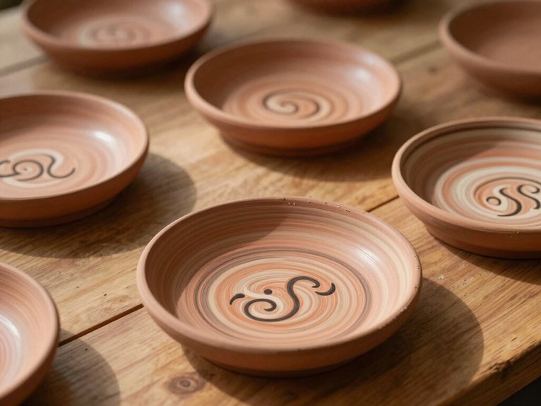
Personalized pottery can really tie a piece together, and monograms or quotes are an easy way to make it feel special fast! Start with Brush prep, then sketch your initials lightly, or pick a short line that fits your mug or plate.
- Use stencil placement for crisp, even letters.
- Match your personal color palette to the room or gift.
- Keep quotes short so they wrap neatly.
- Fire with underglazes, or seal acrylics and hand-wash.
You’ll get a piece that feels like your crew made it, even if it started as plain clay. Tiny text, big charm, zero drama!
Blend a Rainbow Gradient
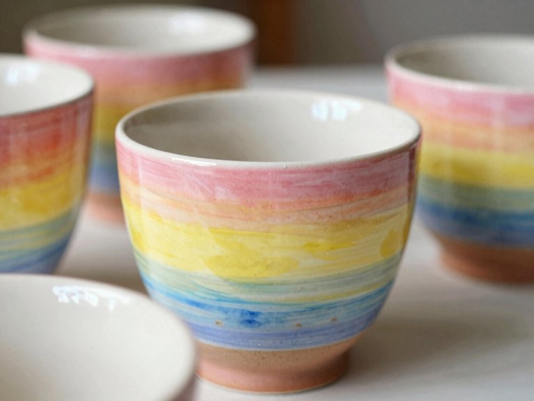
To make your pottery pop with a rainbow gradient, start by planning a smooth ombré fade with just 2–3 glaze or underglaze colors, moving from the lightest shade into deeper tones. Use color wheel basics to pick neighbors that play nice together, and grab a soft brush for easy blending.
Paint in small sections, not one giant swipe, because that keeps the blend controlled and helps you avoid muddy middle tones. Keep moisture control in mind, overlap colors while they’re still slightly wet, and let each coat dry fully. Most underglazes need 2–3 coats, but wow, the fired colors usually look brighter!
Paint Seasonal Pottery Themes
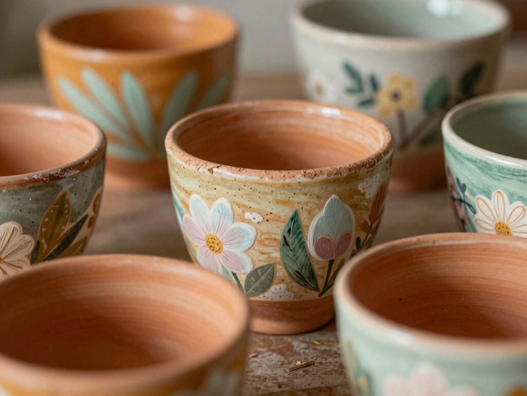
From crisp snowflakes to cheerful spring blooms, seasonal pottery gives you an easy way to make each piece feel fresh, fun, and a little bit magical! You’ll fit right in when you paint with the months, and your mug or plate can feel like it truly belongs to the season.
- Fall: sketch pumpkins, leaves, and tiny polka dots, then add warm oranges and gold.
- Winter: use watercolor inspired washes, star specks, and cool blues for a cozy night-sky vibe.
- Spring: paint fruit, floral clusters, and bright pinks with greens.
- Try seasonal transfer decals, tape your edges, and check food-safe firing rules for practical pieces.
Create Timeless Floral Motifs
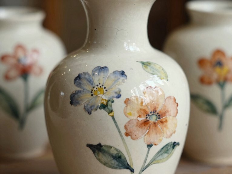
After you’ve played with seasons and color moods, floral motifs are a lovely next step because they never really go out of style—just ask any cheerful daisy!
Start with a dot center, then add petals in layers for a friendly, timeless bloom.
Use a small round brush for details and a medium flat brush for leaves, and don’t worry, this feels easier than it looks.
If you’re using underglazes, plan for 2–3 coats, with each layer fully dry, and keep an eye on kiln firing times.
For a polished look, repeat a few blossoms in small clusters, then frame them with leafy rims.
Safety glove tips help, too!
Design Geometric Patterns With Tape
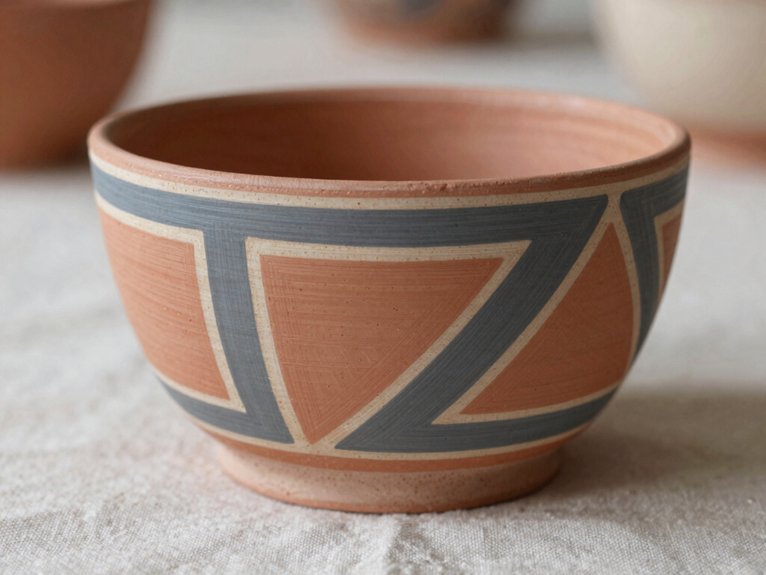
Geometric patterns can feel instantly modern, and honestly, tape makes them way less scary than they sound! You’ll fit right in once you start with a light sketch of triangles, diamonds, hexagons, or stripes, then move that layout onto your bisque mug or plate.
- Press painter’s tape down firmly for clean edges.
- Pick colors with Color choice harmony in mind.
- Paint light to dark, and use drying time planning.
- Remove tape while the paint’s still a bit wet.
Keep a small brush handy for corners, and don’t overload it, or drips may crash the party. Sharp lines, easy vibes, big wow!
Make a Calm Mandala Design
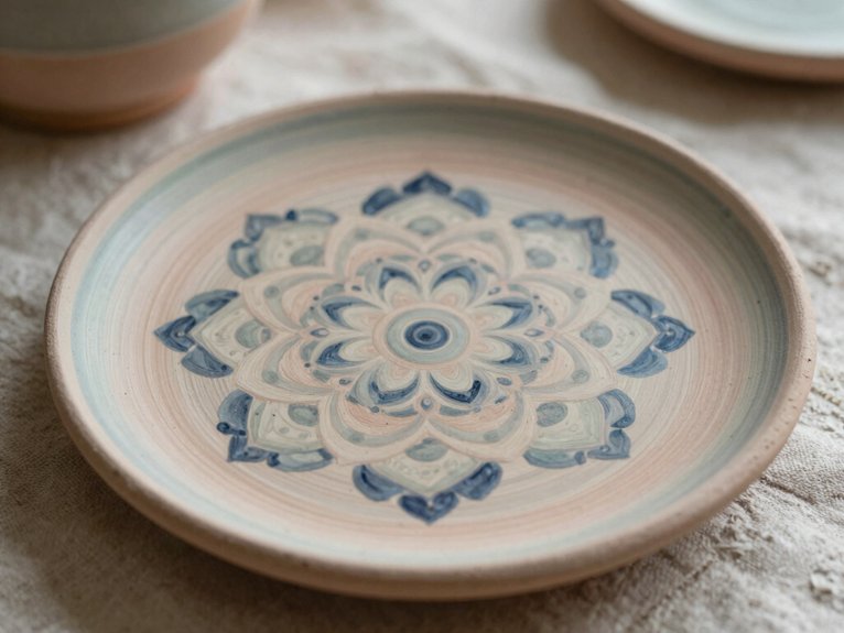
Start your calm mandala by sketching a light pencil circle, then place a tiny dot cluster or simple rosette in the center so you’ve got a neat little anchor point—easy, right?
From there, build outward with repeating rings of dots, soft arcs, and leaf-like petals, and you’ll see the pattern settle into a balanced rhythm that feels soothing instead of fussy.
Use a dotting tool or even a cotton swab, let each ring dry, and add a few thin contrast lines or bold color pops at the end for a pottery piece that looks polished without a big price tag.
Center Dot Foundation
A tiny dot can do big things! Start with color palette selection and glaze safety testing, then place a center dot with a dotting tool or cotton swab. From there, you’ll build calm magic, one ring at a time.
- Mirror each dot so both sides stay balanced.
- Let every dot dry fully before the next ring.
- Make the first dots richer or larger for a soft center focus.
- Finish with thin lines between rings for crisp definition.
You don’t need skilled skills, just patience and a steady hand.
Before you know it, your pottery feels centered, friendly, and totally yours—wow!
Layered Ring Details
With a light pencil line as your guide, you can turn a plain bisque pot into a calm mandala that feels way fancier than it is! Keep a simple circle base, then plan 5–10 bands with even spacing and mindful symmetry.
| Tool | Use | Result |
|---|---|---|
| Dotter | accents | tidy rings |
| Fine brush | lines | crisp edges |
| Tape | masking | clean bands |
| Sponge tip | dashes | soft texture |
Start outside, then move inward, adding dots between thin lines for texture variation. Give each coat drying pauses, and peel tape while it’s still a bit tacky, so your pattern stays sharp.
Paint Nature-Inspired Leaves and Vines
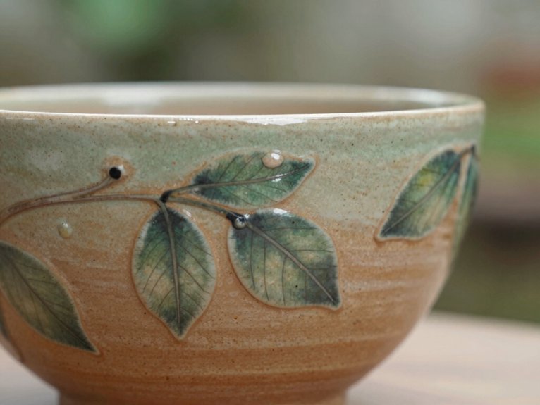
When you want your pottery to feel fresh and a little magical, painting nature-inspired leaves and vines is such a fun move! You can make them cozy, personal, and easy to share with your crew. Start with simple underglazes, a fine brush, and a pencil sketch.
- Paint single leaf strokes, then dry fully.
- Add darker veins after the base sets.
- Sketch a soft S-curve vine.
- Mix sage, forest, and gold shapes.
Try Sculpted textures, too, if your piece has bumps, and use glazing techniques that let leaf details shine. A few highlights make everything pop—cute, right?
Capture Ocean Waves in Blue
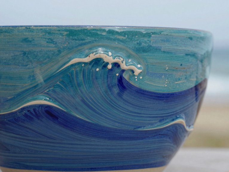
You can make your pottery feel like a breezy day at the beach with blue and white swirls, starting with a light blue wash and then building layered wave brushstrokes on top.
Try changing your brush pressure as you paint, so some waves peak boldly while others stay soft and calm, kind of like the ocean can’t quite make up its mind!
For an extra splashy finish, add thin white foam lines or tiny speckles between the waves, and suddenly your mug or bowl looks ready for seaside daydreams.
Blue And White Swirls
Blue and white swirls can turn plain pottery into a tiny ocean scene, and honestly, it’s a lot easier than it looks! You’ll feel right at home once you start.
- Test your blues first for color testing.
- Check glaze durability before you commit.
- Use a thin brush for wave lines.
- Let each coat dry fully.
Mix navy, mid-blue, and pale sky blue, then sweep horizontal curves across the pot. Keep space between lines so the “water” shows through. For a dreamy finish, add white while the middle layer’s still damp.
Seal it well, and your waves stay crisp—no soggy sea monster vibes!
Layered Wave Brushstrokes
With a few swipes of blue and white underglaze, your pot can start looking like a rolling ocean, and no, you don’t need *decorative* art skills for this!
Grab a medium brush, a smaller one for foam, and a couple of underglaze shades, then paint shallow curves in repeating bands.
Start light, then move darker, letting each semi-dry layer overlap so the edges melt together.
That’s where glaze layering depth sneaks in, plus real wave texture blending.
After each coat dries, add thin dark lines for crests, then leave negative space between bands so the water breathes.
Pretty cool, right?
Try Animal Prints for a Fun Twist
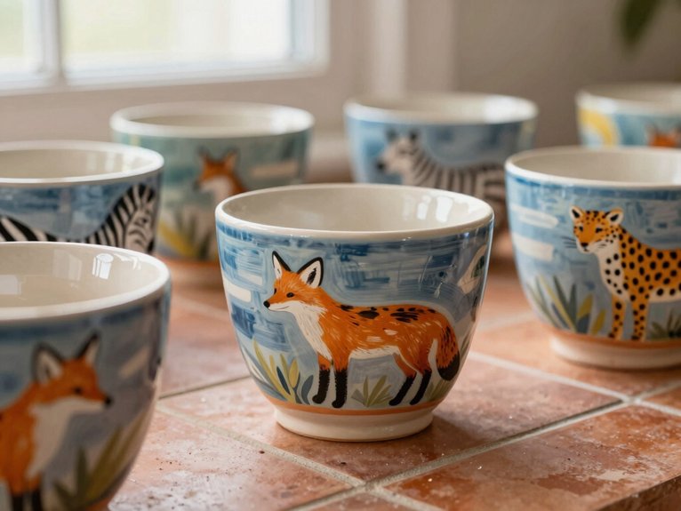
If your pottery needs a little extra personality, animal prints are a super fun place to start! You can make your pieces feel like they belong in your favorite cozy nook, not a boring shelf.
- Leopard spots: stamp irregular dots with a sponge or cotton swab, then add dark shadows.
- Zebra stripes: paint crisp lines, vertical or diagonal, with tape or a steady hand.
- Earthy colors feel classic; teal and pink make it pop.
- Keep it simple for beginner wins, or layer it up for bold drama.
Animal prints also pair nicely with monogram placement and quote personalization—cute and totally yours!
Use Galaxy Glaze for a Cosmic Effect
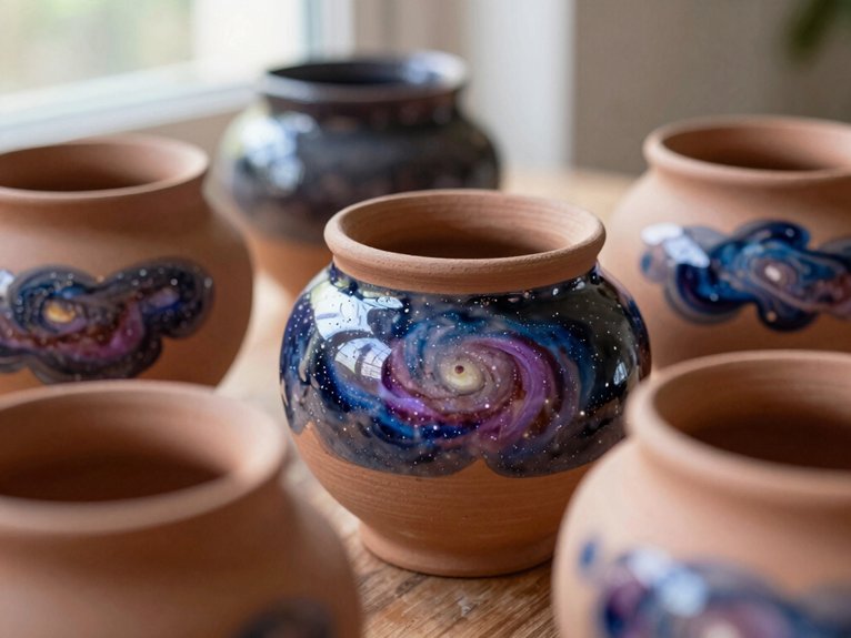
Ready to make your pottery look straight out of the night sky? Choose deep purples and blues, then blend in nebula shades while the paint’s still workable. You don’t need impressive skills, just a bisque piece, a stiff brush, and a little patience, because the magic happens in layers.
| Step | Look |
|---|---|
| Dark base | Midnight sky |
| Blend colors | Soft clouds |
| Flick stars | Tiny sparkles |
| Add metallic | Cosmic glow |
A subtle metallic touch on swirls and edges makes it shimmer, perfect for Seasonal Decor Swaps or Custom Gift Wrapping. If you use acrylics, seal it, then hand-wash only. Your crew’ll think you bought it from the stars!
Add Abstract Brushstrokes and Splatters
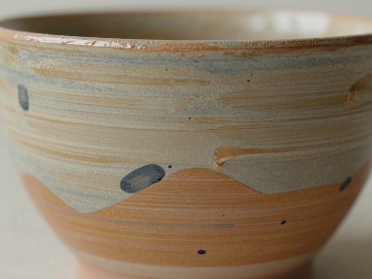
While your base color is still doing its thing, grab a medium-sized brush and paint on bold, loose abstract strokes in one section of the pot, not all over it, because that keeps the design looking modern instead of busy.
Try these quick wins:
- Flick paint for drip-free splatters, wow!
- Use bright teal with deep navy so every speck pops.
- Let each section dry before layering more.
- Mix in Stenciled border accents or Monogrammed charm details for extra personality.
You’ll get a cool, artsy vibe without much cost or fuss.
For lasting results, fire underglazes, or seal acrylics and hand-wash.
Pottery Painting Ideas for Mugs
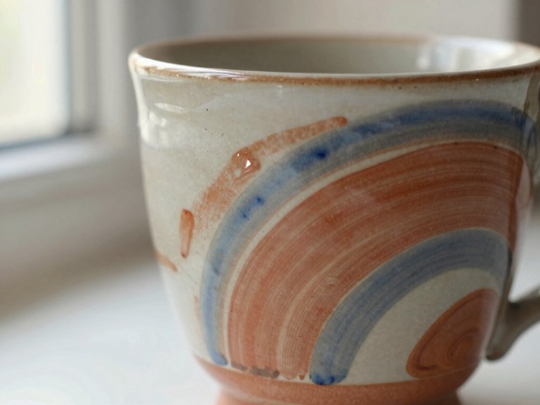
For mugs, you can keep things simple and still make them look super cute! Start with polka dots, stripes, or tiny stars, using a sponge, cotton swab, or brush end for easy control.
Want a personal touch? Add a thumbprint heart or tiny initial monogram, and yes, practice the letters first so they don’t look like they escaped from art class.
For a cleaner vibe, use painter’s tape for half-dipped color blocks or soft vertical stripes.
Try floral clusters or an ombre sunrise blend last.
Follow Glaze safety tips, and plan drying time planning, so food-safe mugs stay vibrant and ready to show off.
Paint Plates and Bowls With Simple Motifs
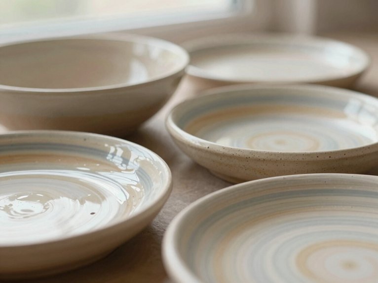
Once you’ve had fun decorating mugs, plates and bowls are next, and they’re a perfect place to try simple motifs that still look polished!
You can keep the design inside the rim or along the edge, so it feels balanced and easy.
- Try tiny dots with a cotton swab.
- Add a thin line with a brush.
- Sketch leaves, then paint them.
- Test Color mixing swatches first, nice and easy!
Use painters tape if you want crisp borders, and let each layer dry.
For food-safe pieces, follow Glaze safety tips or use ceramics-specific paint.
The result? Friendly, handmade charm!
Finish With a Half-Dipped Color Block
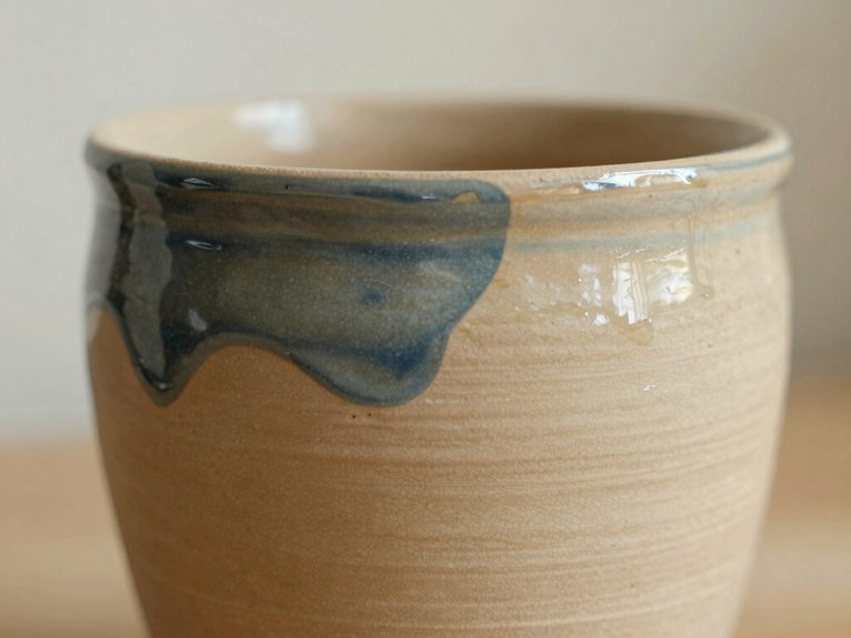
A half-dipped color block gives you that clean, modern contrast right away, and it’s super easy to pull off with just one favorite glaze or paint color—nice, right?
Turn your mug or bowl upside down, or use painter’s tape, so you get a crisp line instead of a wobbly one, and if you want extra pop, build up thin underglaze coats or seal smooth acrylic layers.
Finish with one tiny detail at the border, like a dot or star, and suddenly your piece looks intentional, personal, and a little too stylish for everyday snacks.
Clean Color Separation
If you want a pottery look that feels modern and super crisp, a half-dipped color block is a fun place to start! Choose your base color first, then mark the divider with brush control and test swatches so you feel confident.
- Turn the piece upside down, so gravity helps.
- Use painter’s tape and press it down firmly.
- Paint 2–3 thin coats, letting each one dry.
- Peel the tape while the paint’s still slightly wet.
That sharp edge feels like you joined the cool table on purpose! Seal it for your paint type, and hand-wash if needed.
Modern Minimal Contrast
Love that sharp, clean look? You can join the modern crowd with a half-dipped mug or bowl that feels sleek, not fussy.
For color palette selection, pick two bold opposites, like black and white, then paint only the bottom half with the lighter shade first, using 2–3 thin coats, drying fully between each one.
Next, mark the halfway line with painter’s tape, or try Tape free edging if you trust your hand.
Flip the piece upside down for a crisper stop, peel tape while tacky, then seal it as your studio suggests.
Boom, instant gallery vibes!
Easy Dipped Finish
For an easy dipped finish, start with one base color and then “dip” the lower half of your bisque-fired piece into the paint or underglaze, like you’re giving it a stylish little color-block boot! You’ll feel right at home making this look, and it’s beginner-friendly, cheap, and cheerful.
- Hold the piece steady for a crisp line.
- Use painter’s tape to guide the edge.
- Add 2–3 underglaze coats, drying between each.
- Let it dry fully, then fire or seal it.
Wipe away any creeps fast, so you avoid glazing mistakes. These weatherproofing tips help your dip stay bold, clean, and durable—wow!
Add Texture With Speckles and Stamps
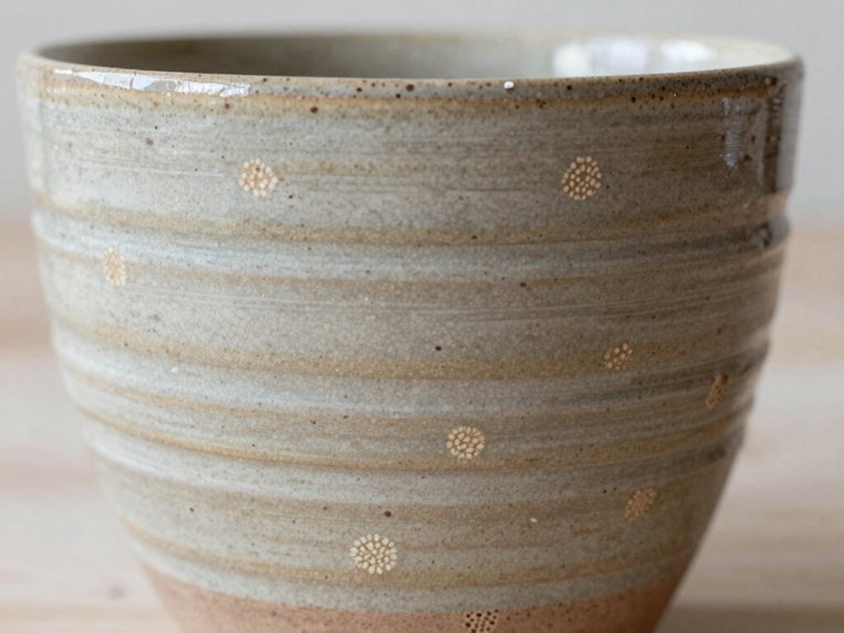
Speckles can turn a plain pot into something that looks playful, modern, and a little bit magical! Use a stiff brush to flick underglaze, or tap a sponge for soft dots, then fade the intensity for a cool speckled gradient.
Want easy control? Try a sponge, cotton swab, or brush end to stamp neat marks. Keep painter’s tape on clean sections, so your stencil edges stay sharp and your glaze blending doesn’t get messy.
Build 2–3 coats, letting full drying time pass between each one. If you mess up, damp sponge texture cleanup works fast, and dried spots can be scraped and repainted.
Match Colors to Your Pottery
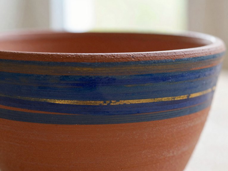
When you pick colors for your pottery, think about the piece’s shape and finish first, because that little choice can make the whole design look polished instead of busy. You’ll fit right in when your colors feel intentional, not random!
Try these Color harmony tips:
- Bold hues for clean stripes on mugs
- Muted pastels for simple line work
- Testing swatches first on paper
- Keep brush water clean between shades
If you’re using underglazes, plan on 2–3 coats and let each one dry. At home, acrylics stay brighter with a clear sealer. A smart palette makes your piece look like it belongs on purpose!
Seal and Care for Painted Pottery
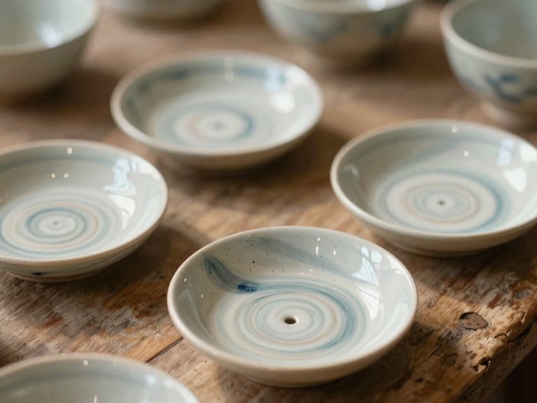
After you’ve painted your pottery, the finishing steps make all the difference, and a little patience here goes a long way!
For kiln-fired pieces, let the studio glaze and firing do the heavy lifting, then check Food safety testing guidance before you serve up snacks.
For at-home acrylic or ceramic paint, let it cure fully, then mist on a clear acrylic sealer spray for long term durability.
Use a clean, dry brush for touch-ups so colors stay crisp, not cloudy.
Keep up with storage best practices and handling precautions, like skipping scrubbers and long soaking, and your piece will stay lovely!
Frequently Asked Questions
How Do I Choose a Meaningful Theme for a Gift?
You choose a meaningful theme by pairing the Gift Recipient’s story with Personal Symbolism and your Style Reflection. You’ll create Handmade Meaning that feels intimate, so they feel truly seen, valued, and warmly included.
What Pottery Pieces Work Best for Beginners?
You’ll do best with mugs, small bowls, and plates—about 70% of beginners start there. They’re easy to hold, forgiving to paint, and welcome Beginner friendly glazing plus Simple brushwork tips, helping you feel right at home.
How Can I Make Hand Painted Pottery Look More Professional?
You can make your hand painted pottery look professional by using layered glazing, steady brush consistency, clean edges, and careful paint dilution. You’ll create smoother finishes, stronger details, and pieces you’ll be proud to share.
What Colors Feel Most Personal for Custom Pottery?
You’ll feel most personal with colors tied to your memories—soft blues, warm terracotta, sage, cream, or a favorite accent. Best Color Matching and Sentimental Palette Selection help you choose hues that feel like home.
How Do I Make a Design Feel Unique Without Being Too Complicated?
You can make it sing like a quiet chorus: balance details, use one stroke designs, add texture accents, choose a limited palette, repeat simple motifs, tuck in personal initials, protect negative space, and layer meaning.